Revisions and Commits
| rDWAPPS Web applications | |||
| D6186 | rDWAPPSe2b48563ac20 misc: Add iframe view for contents and directories | ||
| Status | Assigned | Task | ||
|---|---|---|---|---|
| Migrated | gitlab-migration | T3480 Provide iframe element for the SWH Stories | ||
| Migrated | gitlab-migration | T3489 Implement iframe view for content and directory elements | ||
| Migrated | gitlab-migration | T3351 Define use cases for an iframe to show source code |
Event Timeline
Some progress report on my work of the last days on the subject.
I have added a new view in swh-web taking a SWHID as URL argument that can be embedded in an iframe.
It enables to display a standalone directory or content object from the archive content.
The URL path to it is currently /iframe/(swhid)/, could not find a better name so far.
If a SWHID is provided with qualifiers (origin, visit, anchor), it also enables to navigate back and forth into
the whole source code tree inside that embedded view.
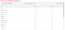
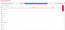
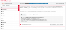
Below are some screenshot examples of how it looks so far.
From that HTML code:
<iframe style="width: 100%; height: 500px; border: 1px solid rgba(0, 0, 0, 0.125);" src="http://localhost:5004/iframe/swh:1:dir:fec5d064a3b90b04a84e4940d68cda3259329045;origin=https://code.ill.fr/scientific-software/takin/mag-core;visit=swh:1:snp:b39bdade7a1064254104af379417dda551ec0e8c;anchor=swh:1:rev:d9c56e60cd9888cff9e9cce3b94284464c831577;path=/tools/scanbrowser/"></iframe>
we obtain:
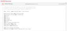
From that HTML code:
<iframe style="width: 100%; height: 500px; border: 1px solid rgba(0, 0, 0, 0.125);" src="http://localhost:5004/iframe/swh:1:cnt:7912d5d3969bf9b60600bd7c9c5e649da86532eb;origin=https://github.com/servo/servo;visit=swh:1:snp:7a7a16a607451fcdaad329c2bf023d0efd0516ad;anchor=swh:1:rev:74f1eb199e67e82ff713f77f7803f02a25966628;path=/python/servo/bootstrap.py"></iframe>
we obtain:
I tried to keep the UI as minimalist as possible.
Apart the directory or source file rendering, there is a fixed header with the following content:
- on the left, the SWH logo and brand name, opening https://www.softwareheritage.org in a new browser tab when clicked
- in the middle, breadcrumbs of the current displayed path to navigate back in source tree
- on the right, a link to browse the SWHID from the main archive website in a new browser tab
- also on the right, when a user navigated in the source tree and the original object is no longer displayed, a link is offered to reset the view to its original state
@moranegg, will it be sufficient for your needs ? This is still a work in progress so I am opened to suggestions of improvements.
This looks great!
I like the minimalist header.
The one thing that is missing is the current SWHID I’m viewing.
Maybe use a SWHID (or a badge) instead of the path in the center of the panel… or as a footer like a reference…
Not sure about this, but we need to know what artifact is identified in the iframe.
The one thing that is missing is the current SWHID I’m viewing.
Maybe use a SWHID (or a badge) instead of the path in the center of the panel… or as a footer like a reference…
Not sure about this, but we need to know what artifact is identified in the iframe.
I propose to replace the "Go to archive" link in previous screenshots by the badge of the currently browsed SWHID (still linking to main archive website), see below:
Looks better with the first implementation with "Go to the archive" :-)
With the badge, it seems right and left side aren't balanced.
Yeah SWHIDs are long so they eat a lot of horizontal space.
How about putting them in a fixed footer then ?
In that case, the "Go to archive" link will point to the homepage of the archive website and clicking
on the badges in the footer open a new tab to browse the request object in the archive website.
That's really nice, but I still prefer the minimalist first iframe :-)
Few options here:
- replace the path with the swhid badge
- have the SWHID in the header in a second line
- keep the footer with a centered SWHID badge (without the repository badge)
@rdicosmo what are your thoughts on the iframe?
I would go for option 1 but the path breadcrumbs should remain as it enables to ease
the navigation inside the source code tree (especially when an iframe points to a directory).
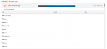
I propose to put it below the iframe header, it will also be fixed.
Below is a screenshot of the result.
Thanks for all this great work...
A few questions/remarks:
- where is the Permalinks tab? I do not see it in the images
- for the url, what about "/embed/" instead of "/iframe/"? "embed" seems to be the canonical term used to designate this kind of things (see YouTube, etc.)
- instead of "go to the archive", why not "View in the Software Heritage Archive"?
- it's great that the iframe can use the width and height attibutes! How do you plan to handle strange values (e.g.: width=10px height=200%)?
where is the Permalinks tab? I do not see it in the images
I did not integrate it in order to keep the UI as minimalist as possible.
Plus as iframes usually have a smaller width and height than browser viewport,
there is good chances the Permalinks tab does not fit in the iframes.
for the url, what about "/embed/" instead of "/iframe/"? "embed" seems to be the canonical term used to designate this kind of things (see YouTube, etc.)
instead of "go to the archive", why not "View in the Software Heritage Archive"?
Much better naming indeed, thanks ! I will adapt accordingly.
it's great that the iframe can use the width and height attibutes! How do you plan to handle strange values (e.g.: width=10px height=200%)?
My current implementation handle responsive design but it is up to the client code to use reasonable values for the width and height of the iframes.
With @moranegg, we were thinking of adding help on how to integrate content and directory iframe view in the SWHID tab, like we did for the badges.
We could then propose good default values for some iframe CSS properties in order to properly integrate it in an external page.
@anlambert; after discussing with @rdicosmo, here are a few context elements:
We are working on different use cases for the iframe, the first is a rather simpler one with the SWH stories, where just having the source code in a minimalist way is best.
In the future we will also need to answer a more complex use-case where the iframe resembles more as an embedded copy of the archive.
Here are also a few comments:
- change "go to archive" to "view in the archive"
- before the SWHID badge add text "Navigating in"
- add a permalinks tab for iframes where one can navigate inside the code (for now this is only for the directory iframe)
We can discuss this further before doing the changes.
In the future we will also need to answer a more complex use-case where the iframe resembles more as an embedded copy of the archive.
Iframe content should remain lightweight with minimalist UI from my point of view.
If you need whole browsing features, I think it is best to use a link to the archive website.
Do you have an example of a complex usecase to get a better idea of your needs ?
- add a permalinks tab for iframes where one can navigate inside the code (for now this is only for the directory iframe)
Ack, I think it is better to always include the Permalink(s) tab then as it offered links to browse objects
related to the current browsed one (revision and snapshot for instance).
Plus it enables to copy to clipboard the SWHIDs and permalinks.
In the future we will also need to answer a more complex use-case where the iframe resembles more as an embedded copy of the archive.
Do you have an example of a complex usecase to get a better idea of your needs ?
The key examples are computer museum websites: they will want to keep the visitor on their website, for visibility reasons, and we need to cater to their needs.
Typically, we should be able to provide them with an embedded view that looks like this (possibly without the "download" and "save again" buttons)
and they will add a thin layer around with the colors/logos/style of the museum.
- add a permalinks tab for iframes where one can navigate inside the code (for now this is only for the directory iframe)
Ack, I think it is better to always include the Permalink(s) tab then as it offered links to browse objects
related to the current browsed one (revision and snapshot for instance).
Plus it enables to copy to clipboard the SWHIDs and permalinks.
Great!
The key examples are computer museum websites: they will want to keep the visitor on their website, for visibility reasons, and we need to cater to their needs.
Typically, we should be able to provide them with an embedded view that looks like this (possibly without the "download" and "save again" buttons)
Ok, got it. Displaying a full snapshot in an iframe will require more work than for the content/directory case but it should be feasible.
Let's start with content/directory first, I would work on adding support for revision and snapshot later.
@anlambert : Looks very good!
Can you show an example for a code fragment where you view a content with a few lines marked-up ?
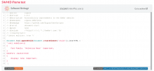
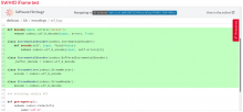
Sure, this is what the iframe content looks like for the following SWHID:
swh:1:cnt:1bf6336571547bcec3f5aa7978ff1c7f247490ce;origin=https://github.com/python/cpython;visit=swh:1:snp:dc98316fd78351ba815adaa8731417473ed8d2f9;anchor=swh:1:rev:679cb4781ea370c3b3ce40d3334dc404d7e9d92b;path=/Lib/encodings/utf_8.py;lines=15-29
For the record, I have disabled the lines selection feature in that case to ensure the user will not remove the emphasized code fragment.
I will finish the tests and submit the code for review tomorrow.
This is really good!
I discussed this option with Kat from Data Current (in charge of the SWH stories interface) and she was wondering if the highlighted text will be centered.
Seems from your example that this will be the case.
If you need us to test this with staging, let me know.
Does this mean that a user of the iframe won't be able to select lines in any type of iframe?
I discussed this option with Kat from Data Current (in charge of the SWH stories interface) and she was wondering if the highlighted text will be centered.
Seems from your example that this will be the case.
Yes the view is scrolled to the code fragment at startup.
Does this mean that a user of the iframe won't be able to select lines in any type of iframe?
Iframe views should not be as interactive as the main archive website and are offered to display
a specific object of interest, they are kind of read only. If you want to highlight a specific code
fragment but the user resets the highlighted lines, that's not really convenient. I can activate back
the feature but I do not think it is a good idea.
Leave as is for a first deployment.
We will test on the partners platform and iterate.
Thanks a lot for pushing this forward, I'm going to suggest the usage of the iframe to the InvenioRDM team and to HAL :-)
