Page MenuHomeSoftware Heritage

Improve swh-web design for mobile browsing
Closed, MigratedEdits Locked

Description

While swh-web frontend is based on bootstrap for reponsive design, browsing the webapp on a mobile device is not really optimal.

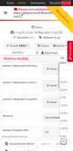
For instance, directory views could be improved to get a look and feel on mobile similar to what GitHub or GitLab offers.
Event Timeline

anlambert triaged this task as Normal priority.Jan 16 2019, 2:36 PM
anlambert created this task.
anlambert added a project: GSoC 2019.
anlambert added a subscriber: kalpitk.

I propose changes to the following to improve the mobile website -

  • In the directory view, 'Mode' can be removed for mobile website. It would look cleaner.
  • In the mobile view, 'Beta version' obstructs the view. I think it would be better to hide this too.
  • The menu in browse, doesn't look nice. I think this would require some rework.
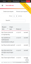
  • 'Donate' button overlaps on most of devices. For mobile devices, either remove the button or maybe remove class swh-position-right.
  • hide 'go to top' button when already on top (for desktop view also)
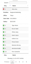
  • DataTable headers don't scroll currently in mobile view. Either make the headers scroll too or make it mobile responsive (it will appear in form of dropdown in mobile view)

@kalpitk , that's a great start.

I agree with your first proposals.

I invite you to submit one Phabricator Diff per point of improvements (you can start coding today If you want).

And just to be clear, I do not ask you to handle all these points for this week (some will be easy but some will be not and will require deep testing).

Implemented during GSOC 2019, closing this.