- Set width of metadata popover to 100% in mobiles (xs screens)
Related T1786
Differential D1553
Improve mobile popovers Authored by kalpitk on Jun 6 2019, 1:35 PM.
Details
Related T1786
Diff Detail
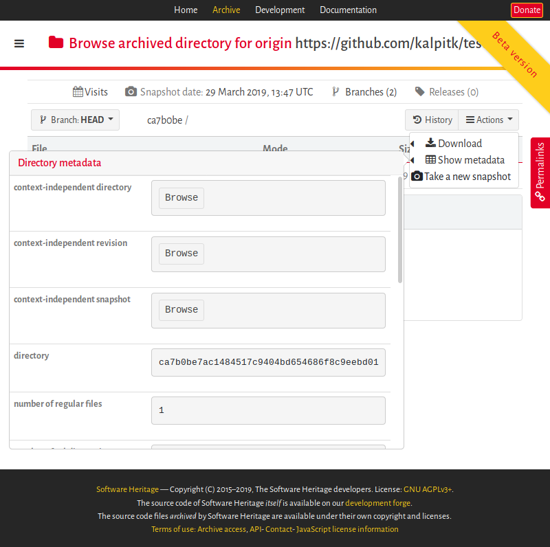
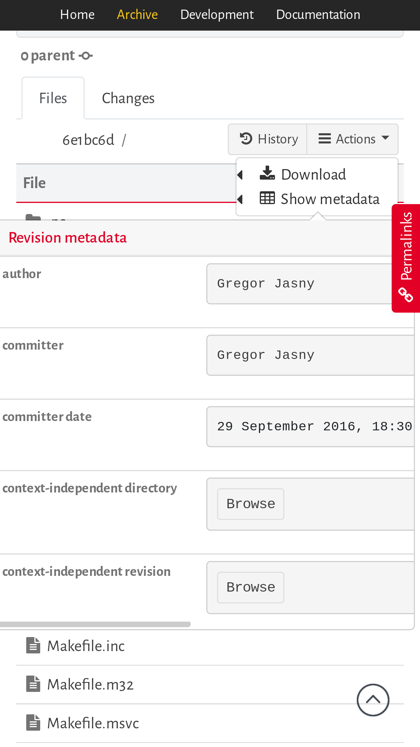
Event TimelineComment Actions Build is green Comment Actions Just a couple of nitpicks for small screens (see screenshot below):
Comment Actions Build is green Comment Actions Build is green Comment Actions Build is green | ||||||||||||||||||||||||||||||||||||||