Changeset View
Changeset View
Standalone View
Standalone View
swh/web/assets/src/bundles/browse/browse-utils.js
| Show All 16 Lines | $('.dropdown-submenu a.dropdown-item').on('click', e => { | ||||
| e.stopPropagation(); | e.stopPropagation(); | ||||
| e.preventDefault(); | e.preventDefault(); | ||||
| }); | }); | ||||
| $('.swh-popover-toggler').popover({ | $('.swh-popover-toggler').popover({ | ||||
| boundary: 'viewport', | boundary: 'viewport', | ||||
| container: 'body', | container: 'body', | ||||
| html: true, | html: true, | ||||
| placement: function() { | |||||
| const width = $(window).width(); | |||||
anlambert: I think you can increase that threshold to 992 (next responsive breakpoint).
For a screen with… | |||||
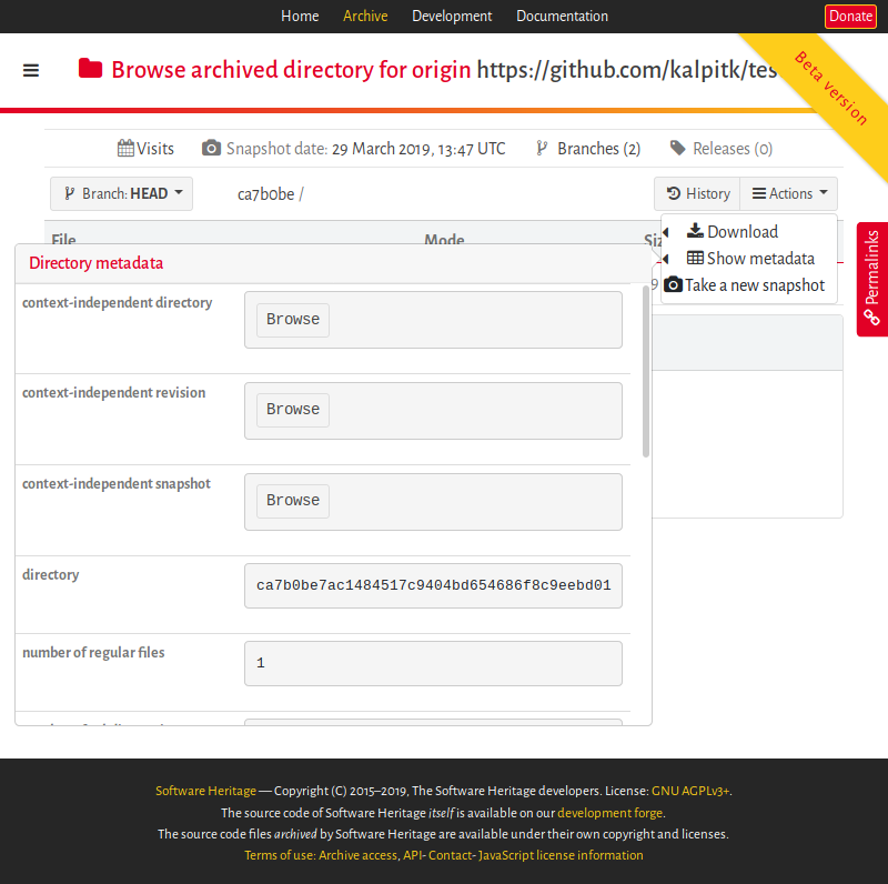
kalpitk: At 800px, it looks fine originally. {F3532489} This is how it shows in my Firefox | |||||
I think that in my example, the popover got oversized due to its content (long lines in a metadata field surely). If you reinstate the max-width css rule for screens width greater than 768 pixels, this should be OK for all metadata. anlambert: I think that in my example, the popover got oversized due to its content (long lines in a… | |||||
| if (width < 768) { | |||||
| return 'top'; | |||||
| } else { | |||||
| return 'right'; | |||||
| } | |||||
| }, | |||||
| template: `<div class="popover" role="tooltip"> | template: `<div class="popover" role="tooltip"> | ||||
| <div class="arrow"></div> | <div class="arrow"></div> | ||||
| <h3 class="popover-header"></h3> | <h3 class="popover-header"></h3> | ||||
| <div class="popover-body swh-popover"></div> | <div class="popover-body swh-popover"></div> | ||||
| </div>`, | </div>`, | ||||
| content: function() { | content: function() { | ||||
| var content = $(this).attr('data-popover-content'); | var content = $(this).attr('data-popover-content'); | ||||
| return $(content).children('.popover-body').remove().html(); | return $(content).children('.popover-body').remove().html(); | ||||
| Show All 30 Lines | |||||
I think you can increase that threshold to 992 (next responsive breakpoint).
For a screen with a width of 800px, the popover will look better if it is anchored to the top, see screenshot below: